(800) 696-4690
Let’s Talk Contact Us


Need Help With Your Marketing?

6 Tips to Improve Your Websites PITA Score
Think about the following scenarios: the clueless driver doing 35 mph in the left lane (when the speed limit is 50); the chatty Kathy that can’t stay off her phone at the gym; the creepy dude trying to make small talk with the cute, young Barista at Starbucks when you’re running late; and finally, last but certainly not least—the schmuck who thinks its okay to trim his fingernails at the airport while sitting next to you in the boarding area (yes, this really happened to me). What do all of these have in common?
Give yourself a pat on the back if you said something like, “they’re an enormous pain in the a_ _.” Do you know what else is a pain in the a**? More than half the small business websites I visit during the course of any given week. That’s right—at least half of you reading this have a website that is a pain in the a**. The more of a pain your site is, the higher your “PITA” score.
What in the world is a “PITA score”, you ask?
It’s your website’s Pain In The A** score. It makes absolutely no sense to spend a bunch of money on online marketing—driving qualified visitors to your website—when your website leaves people feeling like they’re stuck behind an old lady in the fast lane.
So, in this post, I’m going to simultaneously explain some of the factors that go into determining your site’s PITA score, and give you six actionable tips to make your site much easier and more enjoyable for people to use. And don’t worry—lowering your PITA score is even easier than stopping some random dude from trimming his fingernails at the airport.
(in line with the nature of this post, I won’t make you scroll down if all you’re looking for is the six tips)
6 Tips to Improve Your Website’s PITA factor:
- 1. Make your website faster
- 2. Make your phone number easy to find
- 3. Put a contact form on (nearly) every page
- 4. Include lots of information in your site’s footer
- 5. Be accommodating to mobile visitors
- 6. Fix broken links and create a custom 404 page
- **Get a free analysis of your website**
Tip #1: Make your website faster
Few things are as aggravating as a website that takes forever to load. Not only is a fast-loading website more appealing to human visitors, but faster sites are also given a boost in the organic search rankings. That’s right—making your website faster will also improve your organic search rankings on Google. On multiple occasions, Google has publicly said that page load time is a ranking signal.

Tip #2: Make your phone number easy to find
This tip is especially important for need-based, home service businesses—hvac, pest control, plumbing, roofing, etc., but it really applies to any company that wants to generate web leads via the phone.
You want to put your phone number:
a) in a place people can spot it quickly and easily and
b) in a place people expect to find it
Everyone online has attention deficit disorder. In most industries, the average visitor is only on your site for a minute or two so every second counts. If I have to search your website—for even a few seconds—to find your phone number, your site’s PITA score is sky rocketing! Don’t make me THINK—at least not about something as simple as where your phone number could possibly be hiding.
When the web was in its infancy, there were no expectations in terms of where I should look for your phone number. Today, things have changed. If you’re running a home service company, people expect to find your phone number in the upper right-hand side of the page and again in the footer.
Doing something like this is a big risk to your website’s conversion rates:
Try to find the phone number on the website above. Did you find it? Did you find it before or after you put on your bifocals??? Guy Kawasaki has a famous rule for Power Point presentations that says that you should never use a font size smaller than 30 points. To my knowledge, there is no comparable rule for phone numbers on plumbing websites, but there should be.
Here’s the new Blue Corona unofficial rule for where phone numbers should go on home service websites and how large they should be:
Your phone number should be large enough that someone with even mediocre vision can read it from three to five feet away from the screen. It should also be designed/colored in a way that it stands out from the rest of the text on the page.
There’s no way in hell many of you could find and read the phone number on the site above from five fee away from the monitor.
When you’re getting ready to build a new website, be sure to look at the most popular websites in your industry. In a way, the strongest brands (with the most visited websites) are “training” visitors and setting the expectation for where various website elements should be placed/found. If you’re selling one-of-a-kind kitchen designs, you might need a one-of-a-kind website, but a local plumber or HVAC company is better off customizing a commonly used layout… one that puts elements like the company phone number in a place consumers expect to find it.
Tip #3: Put a contact form on (nearly) every page
Similar to putting your phone number in the upper right-hand corner, why force people to visit your Contact Us page to fill out an online contact form? When you force people to do this, you’re being an enormous pain in the a_ _. It’s like making some hunt for a sales rep at a retail store! Instead, put a “mini” contact form on (almost) every page of your site. The fewer clicks it takes me to get in touch with you, the happier I am. It shows me that you respect my time and that you’re easy to do business with.
Tip #4: Include lots of information in the footer section of your site
While you should always include your most important information “above the fold” (the part of the computer screen that displays before the user starts to “scroll” down), you shouldn’t ignore the footer of your website. According to a study done by Nielson, web visitors are 5.9 times more likely to scroll down vs. up, so once someone has scrolled to the bottom of your site—something that does happen—the content above is effectively lost. If the only thing in the footer of your website is your copyright, you’re losing web leads and increasing your site’s PITA score.
Here’s an example of a well-optimized footer from a Maryland window replacement company:
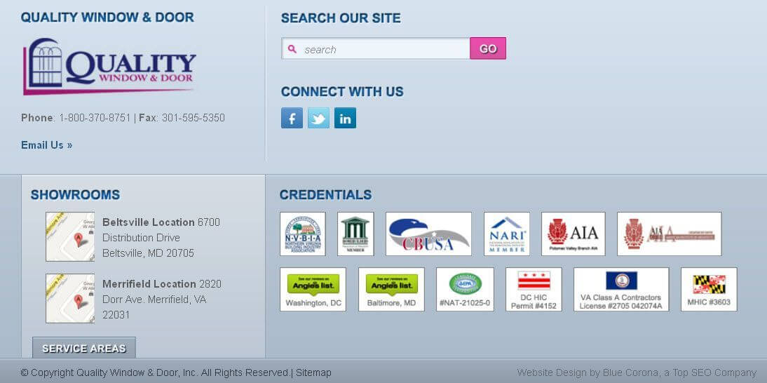
As you can see, it includes:
- Company contact information
- Credentials reinforcing their authority
- A search bar in case you didn’t find what you were looking for before reaching the footer
- Social media icons to establish trust*
- A link to see their service area
*For the record, I’m generally NOT a fan of placing social media icons on every page of your website. Why? What do you think converts better—your website or your Facebook page? Instead, place your social media icons on pages people would find after you’re already doing business together (like a Thank You page following a web form).
Tip #5: Be accommodating to smartphone visitors
It should come as no surprise that visits from mobile devices are going up, up, up. According to comScore, in August 2012, mobile phones and tablets accounted for 13 percent of total Internet page views views—this is more than 100 percent higher than the previous year. Smartphones accounted for the majority of the pageviews. I can’t stress to you enough the importance of having a smartphone-friendly website. Think the comScore data is limited only to “big” companies? Think again. At Blue Corona, most of our clients are small medium sized businesses and when you look at their website, as a whole, they all look something like this:
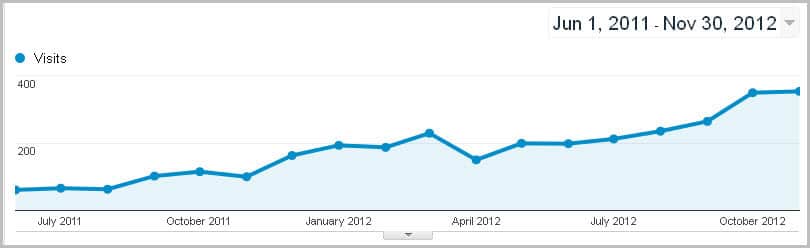 Website traffic from mobile devices has been rapidly increasing since 2010. This trend is only going to continue over the next 3-5 years. Pull out your phone, open the browser, and visit your website. If you have to zoom in to view your phone number, or read the navigation, you’re losing leads and sales and driving your site’s PITA score through the roof.
Tip #6: Identify and fix broken links
Broken links are a great way to quickly increase your website’s PITA score and the blood pressure of anyone finding them. The good news is that broken links are easy to find and fix (if you can’t figure it out on your own, we can help). No matter how diligent you are about preventing broken links, the odds are high that you’ll still have them from time to time. When a visitor clicks on a broken link, they will get a 404 error.
Most people don’t think about it, but when you’re using a web browser to visit and view web pages, what you’re doing is requesting and viewing files on a web server. Your web browser (Internet Explorer, Mozilla Firefox, Google Chrome, Safari, etc.) is requesting documents (web pages, PDFs, etc.) from a web server. If communication with the server fails, you get a 500 error. If the web server cannot find the page or resource you’re requesting, you get a 404 error.
As a webmaster or business owner, when you link to a page or document using the wrong address on the server, the server won’t be able to find the document/page/resource when a visitor clicks the link. This scenario is what we call a broken link.
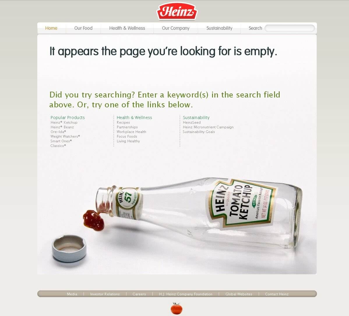
This is an example of a typical (bad) 404 page:
 Why is the page above “bad?”
For starters, the page doesn’t (really) acknowledge the frustration experienced by the visitor that found it. Broken links annoy the hell out of people. The page above offers the standard (minimum) apology—and it increase’s your website’s PITA score.
Compare the page above to some of these examples:
Simply having something other than the default 404 page can create a better visitor experience. The ideal 404 page (if there is such a thing) should combine empathy, possibly humor, and options to help the visitor.
Here is a lighthearted 404 page that might work for some companies. It’s tough to stay mad while looking at Homer Simpson in a dress: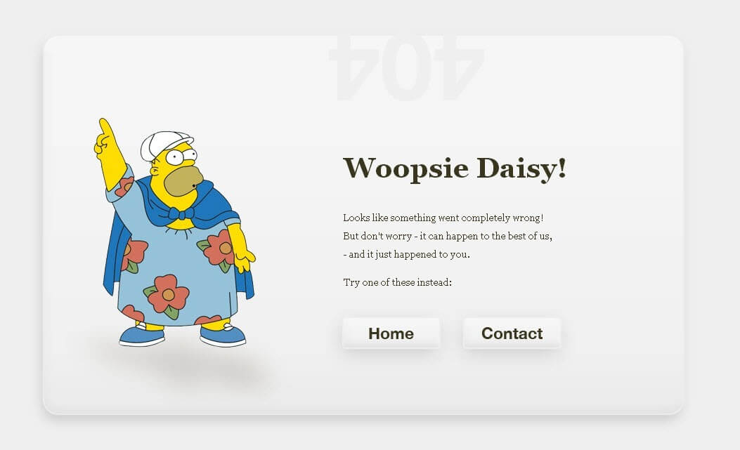
Conclusion
Whether you realize it or not, your website is one of your most valuable marketing assets. Too many companies invest thousands of dollars each month to drive qualified visitors to their sites with pay per click advertising, SEO, and social media without spending a penny analyzing how to improve their website’s usability.
Make one of your 2013 marketing resolutions to invest some time—and maybe a few dollars—assessing and improving your website’s PITA score. Sometimes even seemingly small changes can have a major impact on visitor satisfaction. The issues mentioned above represent the tip of the website usability iceberg.
Enter your website address to receive a free SEO analysis of your site (including an assessment of your site speed and PITA score):

About The Author: Ben Landers is the Founder of Blue Corona, an award-winning, technology-enabled home services marketing agency focused on growing the trades. Want to book Ben for a speaking event? Send us a message.
View more blogs by Ben Landers
Maryland
7595 Rickenbacker Drive
Gaithersburg, MD 20879
Gaithersburg, MD 20879