How to Calculate Customer Lifetime Value (CLV)
How do you calculate marketing ROI?
What is ROAS?
What is website conversion rate?
Website conversion rate is a critically important metric used to measure and improve website performance. It is typically calculated by dividing the number of defined conversions by the number of visits to your website (expressed as a percentage). In some industries, and depending on what you're actually trying to measure/improve, it might be calculated using a segment of visits (vs. all visits). For example, a local plumber serving Colorado might have a 4% conversion rate when using all visits, but a 14% conversion rate when visits are segmented to only calculate the number using visits in Colorado--after all, can the local plumber really expect a visitor from China to convert? Not likely.
In the quest to get more business from the web, most businesses tend to overlook improving conversion rates in favor of generating more traffic. In some cases, this makes perfect sense. If only a handful of visitors come to your website each month, you may not even have enough traffic to run the tests necessary to improve your site’s conversion rate. On the other hand, there are companies that already have more than enough traffic to do CRO testing, but they overlook it.
OTHER HELPFUL LINKS:
Conversion Rate Optimization
Start Tracking Your Conversion Rate
Blogs About Conversion Rate
I Need More Traffic
What is a conversion?
Web marketing people love to create new terms for things you thought you already understood! In the world of Internet marketing, the word “conversion” represents any action on your website that is more valuable than someone that visits your site and leaves without doing anything. What constitutes a conversion depends entirely on the industry and on the individual company.
Here’s a short video we created to explain conversions and how you can track conversions in Google Analytics:
For business to business (B2B) marketers or complex business to consumer (B2C) sales (i.e. a remodeler), common conversions include:
- Visits to a key web page
- Views of a marketing video
- White paper downloads
- Email newsletter sign up
- Web form submission.
For a business to consumer (B2C) company that offers more “need based” services (i.e. the local plumber, hvac company, etc.), common conversions are typically a bit more tightly defined and might include:
- Web form submissions (i.e. lead, inquiry, appointment request)
- Phone calls (i.e. lead, inquiry, appointment request)
- Views of a map/directions page (applies to folks with a retail store or showroom)
Other terms that are interchangeable with “conversion” include: goal, upper funnel action, lower funnel action, lead, action, and event (I’m sure there are dozens of others, but you get the point).
OTHER HELPFUL LINKS:
What is Bounce Rate and is it important?
One of the more commonly referenced website analytics terms is "bounce rate." What is bounce rate? What does it mean? Is it an important metric to monitor? Let's start with defining what a bounce is. A bounce occurs when someone visits your website, views a single page, and leaves. In this scenario a website tracking tool like Google Analytics, would report one bounce or a 100 percent bounce rate (depending on which type of report you run/view).
What Bounce Rate Tells You
Watch the first few minutes of this video:
In the video above, web analytics “guru,” Avinash Kaushik, defines a bounce as, “I came; I puked, and I left.” The implication is that high bounce rates are bad – that the content on your site didn’t match what the visitor was looking for so they left without viewing another page. It’s probably happened to you – it happens to everyone. A friend emails you a link to a website and tells you to check it out, you visit the page, don’t see anything they like and leave. That would be a 100 percent bounce. Maybe you search for something on Google – ex. “best local plumbing company in Denver”, you click the top result, realize your on Service Magic’s website (when you wanted to contact a local plumber directly), so you leave to try again.
A high bounce rate can be a sign that your content is not targeted to the visitors wants and needs, but a high bounce rate can also be a positive indicator. Which it is depends on the answer to this question, “can you get value out of a single page visit?”
Think about this for a moment…
Most types of web leads – a white paper download, registration for a webinar, email newsletter sign up, web form submission, etc. – require the visitor to view multiple pages (resulting in a zero percent bounce rate). If these (multi-page visits) are the only ways your business generates leads, Avinash is correct, a high bounce rate is bad. However, what about businesses that get leads via phone?
Let’s say you own a plumbing and hvac company in Arvada, CO. Someone searches Google for “furnace replacement Denver CO”, finds and clicks the furnace replacement page on your website, they pick up the phone and call you to see how quickly you can get to their house. As soon as they book the appointment, they close their laptop and get on with the rest of their day. How would Google Analytics report this visit? You guessed it – as one bounce (or a 100 percent bounce rate – depending on the report you view).
If this were your business, would this scenario be considered positive or negative? Positive, of course – you’d take single page visits all day long! So, you need to consider a few other metrics before making a determination as to whether a high bounce rate is bad or good.
Using Bounce Rate Data to Improve Your Site
Here’s a simple way to use bounce rate data in Google Analytics to improve your website:
- Go into Google Analytics and look at the left-side navigation menu
- Click Content > Site Content > Landing Pages
- Above the chart, click > Secondary dimension > Traffic Sources > Keyword
- Use the Advanced Filter to remove (not set), (not provided), and branded keywords
- Sort the table by Bounce Rate descending (click on the column heading)
From this process, you should see a whole bunch of visits that look like this:
What you’re looking at in the screenshot above is a page from a local Electrical contractor in Baltimore, MD. Someone searched, “3 phase digital ampere meter” and the ranked page in the organic search results was the electrical company’s homepage. Now, there’s nothing about “3 phase digital ampere meter” on this company’s homepage, so the visitor “bounced.”

IF this is a valuable search phrase for the company in this example (it’s not, but let’s pretend it might be), they’d be wise to either a) create a new web page specific to this keyword OR b) add something to their homepage about this keyword – like a highly visible call-to-action (CTA) button.
OTHER HELPFUL LINKS:
Other Analytics FAQs
Marketing Analytics Blog
Analytics Services
What is Google Hummingbird?
On September 26, 2013, Google announced that it had revamped and updated it's search algorithm, the formula it uses to sort through all the information on the web and return to you what it believes to be the most relevant and authoritative results. The nickname for the new update is Hummingbird, which is said to be because it allows Google to return results quickly and precisely.

Why Google Hummingbird Matters
Algorithm updates are nothing new, but Hummingbird represents (arguably) the largest change since Google’s last update in 2010 dubbed “Caffeine.” So, why the update? One of the goals is to allow Google to better respond to longer and more complex queries. When people first started using search engines, it wasn’t uncommon for them to enter single word queries.
Need a plumber for your Denver home? Back in the early 2000’s, you probably searched, “plumber.” Today, you might search, “top rated plumbers serving Arvada, CO 80002.” When search becomes voice-driven, you might say, “which plumbers in Arvada, CO have received the best ratings for sewer line replacement services?” The Hummingbird update has been engineered to better handle the increasingly more complex questions being presented to Google—whether via traditional search or someone speaking into their smartphone.
What Hummingbird Means for Business Owners & Marketers
As search queries get more question-answer oriented, complex, and conversational, the content on your website should evolve accordingly. For years, Google has told us to focus on providing a great user experience. This was easier in an era where all searches and web visits happened on desktop computers. With the explosion of devices used to access the web, the context in which people are searching and visiting websites is far more complex.
The needs, with respect to your website, are often much different depending on the device being used. Business owners and marketers looking to maximize their website’s performance must become increasingly adept at anticipating and adapting their website(s) to these changes in context and visitor behavior.
OTHER HELPFUL LINKS:
Search Engine Land FAQs on Hummingbird
Forbes Article on Hummingbird
SEO Services
SEO Blog
Google Rolls Out Hummingbird
What is Co-citation and Co-occurrence?
Co-citation and co-occurrence are an alternative to traditional link building for SEO. While definitions vary, co-citation happens when website A links to websites B and C. In this scenario, websites B and C are said to be related through co-citation because they both are linked from website A. Co-occurrence refers to the text before and after a hyperlink.
Example of Co-citation
Here’s an example of co-citation:

In the example above, website A is linking to websites B and C. Websites B and C are said to be related by co-citation. In a way, there is a link or a relationship established between them even though no physical, direct link between them exists.
Example of Co-occurrence
Here’s an example of co-occurrence:

The Possible SEO Implications
For years, link anchor text appeared to be a large and heavily weighted factor in the search engines ranking algorithms. In other words, if you wanted to get your website to rank well organically for the keyword phrase “DC plumbing company,” you would attempt to acquire a lot of links to your website using that exact keyword phrase and perhaps some related variations of it.
Of course, once SEO companies and business owners discovered this ranking signal, many went about trying to create as many keyword anchor text links as possible—often using any means necessary (and not necessarily following Google’s webmaster quality guidelines). And so the proliferation of keyword anchor text link spam began. Suddenly, 30 keyword anchor rich links from as many low authority websites had the potential to be more beneficial to your organic rankings than one link using branded anchor text from a highly authoritative website.
Co-citation and co-occurrence are an important SEO development in that they have the potential to take the emphasis off “SEO trickery” and reinforce the importance of acquiring mentions and references from truly authoritative websites. To learn more about Blue Corona’s SEO services, click here. If you need help developing a long-term SEO strategy and implementation plan, contact us today!
OTHER HELPFUL LINKS:
SEO Questions
SEO Blog
SEO Services
What is NAP and does it help SEO?
NAP stands for Name, Address, Phone Number. NAP is critical for businesses wishing to rank well in the local organic search results, because search engines like Google take the data into account when determining which companies to show for geo-targeted searches. What can businesses do with their NAP to boost their local search rankings?
For starters, make sure that your NAP is correct – both on your website as well as on other sites throughout the web. Local SEO experts believe that Google and the other search engines cross-reference your NAP information across a variety of websites as a validation that you are a legitimate business. For example, it’s incredibly unlikely that a “made for SEO spam site” (i.e. not a real business) is going to have a physical address listed on their website let alone consistent NAP information on sites ranging from local directories and Yelp to the Internet Yellow Pages. The more “local citations” you can build up with consistent NAP information, the better.
Where should you enter your NAP?
In terms of local citations, it’s probably worth listing your business on any reputable directory – especially local directories and/or industry specific directories. InfoUSA, local chambers of commerce, the BBB, Yelp, Citysearch.com, IYP sites (painful, but probably worth a shot), 411.com, merchantcircle.com, foursquare.com, etc.
Download Our Free 7-Step Guide to NAP & Local SEO Now
For a more detailed description of NAP and how it helps your SEO, read our NAP consistency blog post here. Or skip straight to the point and download our free guide to NAP and local SEO for your company right now. Just click the image below for your free download.

OTHER HELPFUL LINKS:
How SEO Works
SEO Services
SEO Blog
SEO Case Studies
SEO Results
Does linking to other websites help or hurt SEO?
There’s a common belief that has spread through the SEO community faster than a cold in a nursery school that linking to another website will negatively impact your website’s rankings and SEO. But is it true? Can linking to another website hurt your website’s organic rankings? Is this always the case or are there times when linking to another website can actually improve your site’s rankings?
Think for a moment about what Google ultimately wants. Google wants its users to find the most relevant and authoritative websites for any given search query. When you link from your website to other relevant and authoritative websites, you’re adding value and providing a great service to searchers.
To us, it stands to reason that Google would interpret your actions as helpful and that they might actually cause a lift in your site’s authority and perceived relevance—two extremely important factors for getting ranked on search engines.
We’re in the process of performing some tests to determine (with more certainty) that they might actually cause a lift in your site’s authority and perceived relevance—two extremely important factors for getting ranked on search engines.
We’re in the process of performing some tests to determine (with more certainty) whether outbound links help or hurt your website’s rankings and SEO.
In the meantime, before linking to another website, you should consider the following:
- How strong is your website’s authority?
- How often have you linked to other relevant, authoritative websites in the past?
- How strong are your website’s rankings today?
- Is your site informational or commerce-oriented?
- Is the website you’re considering linking to relevant to your business/topic?
- Is the site you’re considering linking to an authority or subject matter expert?
- Like a good referral, does the site you’re thinking about linking to make you look better/smarter or suspect?
- Set SEO aside, would the site you’re considering linking to be beneficial to your visitors/audience?
We’re of the general belief that your long-term SEO strategy is simple—free from tricks. To have a website that ranks consistently high in the organic search results, you must establish and promote your site as THE authority for what you do in the markets you do it. If linking to another website provides support for the argument or point you’re trying to make, provides genuine value for your readers, and makes you look good, you should link out to the website in question. If the website you’re linking to has the potential to make you look worse or to call into question your intellect, don’t create a link.
OTHER HELPFUL LINKS:
Why XML Sitemaps are important for SEO
What is an XML Sitemap and why is having one important for SEO? Good question! Think of your website as a house and each page of your site as a room. You can think of an XML Sitemap like a blueprint for your house and each web page were a room, your XML Sitemap would be a blueprint—making it easy for Google, the proverbial home inspector of the web—to quickly and easily find all the rooms within your house. XML Sitemaps are important for SEO because they make it easier for Google to find your site’s pages—this is important because Google ranks web PAGES not just websites.
There is no downside of having an XML Sitemap and having one can improve your SEO, so we highly recommend them.
XML Sitemaps are especially important if:
- You have pages on your site created dynamically (e.g. some e-commerce sites)
- Your site is not well-structured or well-linked (internal links)
- Your site has few external links or is new (a newly developed site just set “live”)
- Your site is large and/or has lots of archived content that may not be well-linked.
Other XML Sitemap Considerations
XML Sitemap Formatting
Some website content management systems give you the ability to automatically create an XML Sitemap. If you use one of these programs or an auto-XML Sitemap generator, make sure that the output is in the correct format and is error-free. For example, Google requires that all XML Sitemaps adhere to a specific protocol—Sitemap Protocol 0.9. Your XML Sitemap must start with this tag: <urlset xmlns=”http://www.sitemaps.org/schemas/sitemap/0.9″> and must use UTF-8 encoding.
Sitemap Verification
Once you’ve created your XML Sitemap and uploaded it to your webserver, you will want to verify it with the search engines. Google makes this easy via Google Webmaster Tools. Just make sure your Sitemap is in the correct format and has been properly uploaded to your webserver before you attempt to verify it.
OTHER HELPFUL LINKS:
What is duplicate content?
What is Google Penguin?
When Google makes a major change to their algorithm, they often give it a name. In April 2012, Google made a major update to their organic search ranking algorithm dubbed “Penguin.” The target of Google’s Penguin update is… wait for it… webspam! The likely targets of the update – sites violating Google’s Webmaster Quality Guidelines (sites participating in keyword stuffing, link schemes, and various other types of over-optimization).
Google Penguin Update / Release History

OTHER HELPFUL LINKS:
What is Google Panda?
Periodically, Google updates their organic search ranking algorithm. When they do, the updates are often given nicknames. On or around February 23, 2011, Google made a major update to their algorithm dubbed “Panda” by some and “Farmer” by others. According to Google, the update impacted roughly 12 percent of the organic search results, and the goal was to reduce webspam (low-quality sites ranked highly in the Google search results). Most of the sites negatively impacted by the updated appeared to be “content farms” – sites creating page after page of relatively low-quality content (hence the name “farmer”).
Google’s Panda updated reinforced to many SEO companies, the value of creating unique, relevant, and remarkable content.
OTHER HELPFUL LINKS:
Which search engine gets the most traffic?
The majority of the world now uses the internet to solve their problems, and about 93% of online experiences begin with a search engine. When most people hear “search engine,” they think of Google. However, Google isn’t the only search engine consumers use to find information—there are multiple types of search engines. For example, Bing is the default search engine on many computers and browsers, most East Asian users use Baidu, and Yahoo! still commands some search volume.
What Are the Top Three Search Engines?
Netmarketshare tracks market share statistics for internet technologies and releases a report on the U.S. search marketplace (which shows which search engine gets the most traffic) each year. As you might expect, Google remains the big dog, claiming 73% of search volume on desktop devices and 81% on mobile devices. Baidu (often dubbed the Chinese Google) claims second place with 13.28% of desktop search market share and 16.18% on mobile. In third place is Yahoo!, followed by Bing. So, if you’re optimizing your website or reviewing your search engine rankings, in most cases, you should focus primarily on Google, Yahoo!, and Bing, unless you want market share in China—in which case Baidu should be your best friend. You can see the search engine list and respective market share below:


LIST OF TOP SEARCH ENGINES AND THEIR SEARCH ENGINE MARKET SHARE
Desktop:
- Google: 73.04%
- Baidu: 13.28%
- Bing: 7.91%
- Yahoo!: 3.70%
- Yandex: 1.11%
- Ask: 0.42%
- DuckDuckGo: 0.24%
- Naver: 0.10%
- AOL: 0.06%
- Dogpile: 0.03%
Mobile:
- Google: 81.53%
- Baidu: 16.18%
- Yahoo!: 0.89%
- Bing: 0.80%
- Yandex: 0.26%
- Naver: 0.13%
- DuckDuckGo: 0.11%
- Ask: 0.05%
- Dogpile: 0.02%
- AOL: 0.01%
HOW MANY PEOPLE ARE USING SEARCH ENGINES?
The data from Internet live stats shows that the number of daily searches on Google is over 3.5 billion, which equates to 1.2 trillion searches per year worldwide.
OTHER HELPFUL LINKS:
How SEO Works
SEO Services
SEO Blog
SEO Case Studies
SEO Results
Does Google index .co domain names?
In the past, .co domains were used for the country of Columbia. Recently, domain registrars like GoDaddy have begun pushing them to webmasters and business owners from all countries as an alternative to .com. If you’re wondering whether a .co domain will rank well on Google, the answer is, “yes.” Major companies like Overstock.com have even started using .co in their traditional advertising and marketing (go to O.co as a shortcut to Overstock.com); however, .co domains don’t seem to get the same weight that .com domains get, so if you’re a small business you should definitely first try to get a .com address.
OTHER HELPFUL LINKS:
How SEO Works
SEO Services
SEO Blog
SEO Case Studies
SEO Results
What are top-level domains?
Technical jargon aside, in the domain bluecorona2dev.wpenginepowered.com, .com is the top-level domain (note: top-level domains are NOT case-sensitive). Created in 1998, The Internet Corporation for Assign Names and Numbers or ICANN, a nonprofit private organization in California, oversees a number of Internet-related tasks. One of these “tasks” is the management of top-level domains or TLDs. Recently, due to the growth of the web, there has been a big push to create new brand-centric TLDs such as .google or .bluecorona. This proposed change could have a MAJOR impact on how businesses market and represent themselves online.
Historically, TLDs have been organized into several groups – Countries, Categories, and Multiorganizations. Some people don’t realize it, but TLDs actually have meaning behind them. For example, .com is for commercial (“for profit”) entities. In order to get a .museums domain, you must be verified as a legitamate meseum (who knew!?). In June 2011, ICANN voted to allow the creation of generic top-level domains (gTLDs) so you can register things like .yourcompanyname. Before you get too excited, it’s worth noting that it’s going to cost you $185,000 to apply for a generic TLD! That’s right, $185,000!
The impact gTLDs will have on online marketing and SEO is still unclear. Danny Sullivan from Search Engine Land was quoted telling people to Google something travel related and count the number of domains you see with the already in existence .travel TLD. He joked, “You won’t need more than one hand. You probably won’t need more than one finger. You probably won’t need any fingers at all!” One thing is certain – this change is going to cause big brands a major headache as they flury to register their existing trademarks and products (and at $185,000 per TLD, protecting your assets online could get pricey!).
OTHER HELPFUL LINKS:
How Generic TLDs Will Affect SEO
SEO Blog
SEO Strategy & Services
SEO Case Studies
SEO Results
What are Backlinks?
When one website links to another website, it’s called a link. Other terms commonly used by SEO companies and online marketers include: backlink, linkback, inbound link, incoming link, inlinks, and inward links. Links are important for SEO because search engines like Google use them as a gauge or measure of a website’s relevance and authority.
Good Links VS. Bad Links
Google and the other search engines want to provide their users (searchers) with the best possible results given the search query. Better, more accurate search results, mean happier users. Happier users are more likely to return and use the same search engine the next time they have a need. More new and return visitors means more ad impressions and opportunities for the search engine to attract clicks on their paid ads – their primary source of income.
Search engines use links as a measure of a website’s relevance and authority, but not all links are created equal. Google and the other search engines must consider the relevance and authority of the linking site. If you’re a car manufacturer, a link from bobsfavoritecoolcars.com is probably not going to carry the weight a link from consumerreports.com would have.
Good links come from relevant and authoritative websites. Bad links come from irrelevant directories and/or low-quality websites. There are millions of directory websites that have been created for a single purpose: to game the search engine algorithms. In the past, links from these types of sites has helped companies improve their rankings. However, the search engines have become far more adept at identifying such sites and either penalizing them or removing them from their results altogether.
How to Acquire Good Backlinks
The best way to acquire “good” backlinks, inbound links, or whatever you want to call them is by creating unqiue, relevant content that helps your prospective customers do what they do better (make better decisions, avoid common mistakes, etc.). If you’re a roofing company in Maryland, this might mean creating a Roofing Buyer’s Guide to teach new homeowners how to hire the right roofing contractor. If you’re a window replacement company in Maryland, you might create a Window Buyer’s Guide or a virtual wall of windows that allows homeowners to compare various brands of replacement windows. When you create great content, often times, people will find it by searching and link to it without you having to ask them. However, you should also promote the content you create by alerting other websites and companies to its existence.
Want to know who is linking to your website, and how your site stacks up against your competitors? Contact one of our SEO experts for a FREE analysis!
OTHER HELPFUL LINKS:
How SEO Works
SEO Services
SEO Blog
SEO Case Studies
SEO Results
How do I choose the right keywords?
Choosing the right keywords is a critically important aspect of an SEO campaign. Typically, it starts during the website audit process and continues for the life of an ongoing SEO campaign. Unfortunately, not everyone thinks about your business the same way you do, so choosing the right keywords can be more difficult than you think! Blue Corona has developed a number of special, proprietary keyword research and selection tools that, combined with our experience, make intelligently choosing the best keywords much easier than any alternative method we’ve found (and we’ve analyzed A LOT of keyword research frameworks!).
Our keyword selection process involves creating a matrix where the optimal keywords are chosen based on the economics of your business (the value of a click on XYZ term), the search volume for various keywords, the competition, and your goals, budget and timeline. For example, if your timeline for SEO results is short, you should choose high-value keywords that have search volume associated with them, but that are not so competitive that you cannot rank for them within your allotted time frame.
Contact us to learn more about how to select the right keywords for your business and/or get a free SEO analysis of your website!
OTHER HELPFUL LINKS:
How SEO Works
SEO Services
SEO Blog
SEO Case Studies
SEO Results
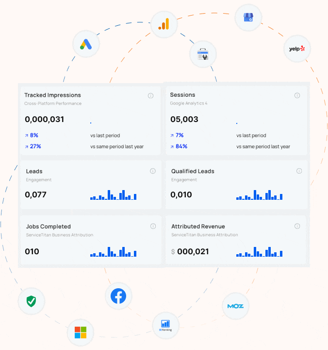
How does Blue Corona track SEO success?
If you can’t measure it, you can’t manage it. You can’t win the game if you don’t know the score. Despite a million quotes which suggest that you can’t maximize your business success unless you track your results, most business owners and marketers are still not accurately tracking their advertising, marketing, website, or SEO. Most online marketing companies treat tracking and reporting as an after thought – the last step. At Blue Corona, it’s the first step in every SEO engagement.
HOW WE TRACK SEO SUCCESS
The goal of any SEO campaign is to generate sales and drive business growth. Ranking for keywords no one uses is worthless. Before you invest in SEO, you need to identify some baseline measures. These include (but are not limited to):
- The number of leads you receive today for organic search (not just web leads either!)
- Your lead to sale conversion rate (i.e. how much revenue do you receive from organic search today)
- The number of non-branded organic search visits you receive each month
- Your rankings for high-value target keywords (percentage of #1 listings, top 10 listings, and total listings)
When we enage a new client, we always start with an SEO audit – which includes the implementation of more accurate tracking tools. Our core values require that every member of our team “act like an owner” and operate in a way that every client engagement can be a case study. We can’t do this if we don’t collect pre-SEO campaign baseline data and, as a business owner, you can’t intelligently evaluate your post-SEO campaign results without this information.
Learn more about how Blue Corona can help you track your SEO success.
OTHER HELPFUL LINKS:
How SEO Works
SEO Services
SEO Blog
SEO Case Studies
SEO Results.
How much does SEO cost?
One of the most common questions we get – particularly from small business owners is, “what does SEO cost?” Blue Corona’s SEO process starts with a website audit, followed, 85 percent of the time, by an ongoing SEO campaign. Website audits are customized for individual businesses, so the prices vary, but the typical range is $2,500 – $3,500 (audits for larger “enterprise” websites can be considerably more). Ongoing SEO ranges from consulting to “do it for me” SEO services where Blue Corona’s team acts like your own in-house SEO department (for a fraction of the cost of having your own SEO team). Ongoing SEO ranges from $1,500 per month on the low end to $20,000 (or more) per month on the high end.
You might be wondering what the difference is between our website audit and the “free” SEO audits you receive or are offered from other SEO companies. Like most things in life, you tend to get what you pay for. As part of our sales process, Blue Corona offers a free SEO analysis, but the level of detail is a fraction of what we uncover in our paid SEO audit. The typical SEO analysis performed as part of our sales process takes roughly an hour. The typical paid SEO audit and recommendations report takes a minimum of 30 hours and some more than 100 hours.
Some business owners also wonder why they have to pay for ongoing SEO. The changes recommended during a typical SEO audit fall into three categories: code and site structure changes, on-site content changes, and off-site changes. If you have an in-house staff capable of implementing the recommended changes from a website SEO audit, you may not have to pay a company like Blue Corona for ongoing SEO; however, most companies lack the specialized resources and expertise required to do so.
How does SEO work?
SEO works by making it easier for search engines to find your website, and recognize your site as both relevant and authoritative (given the search query). One of the number one complaints business owners have about SEO, and SEO companies, is the lack of clarity with respect to what work is actually being done for the fees charged. Blue Corona has a proven SEO process that is both straightforward and transparent.
Broadly speaking, our SEO process goes like this:
1. Website audit
2. Initial Site Optimization
3. Content Marketing
If you don’t (accurately) measure it, you can’t manage it, so our SEO process starts with a comprehensive audit of your website. Every audit is customized, but the first step is to install special website tracking tools and identify key metrics related to SEO (things like your website’s true visit-to-lead conversion rate, the exact number of leads – phone and web – you receive from organic search, etc.). Baseline data allows us to live up to our promise to measurably improve your ROI from organic search post SEO campaign.
With accurate tracking in place, out account management team does a “soak” on the economics of your business. If you’re like most companies, you don’t have an unlimited budget for SEO, so prioritization is key. We are business experts first, SEO people second. By understanding the numbers side of your business – how much profit is generated by various types of customers, the leverage points within your business, etc. – we can help you get the greatest ROI from your SEO budget (whatever it may be).
As part of the audit, we will analyze your website code, site structure, on-site content, and overall web prescence. Because SEO is a zero sum game – meaning, to improve your site’s visibility, you have to leap-frog higher ranked competitors – we do the same analysis for your competitors (and you’ll be blown away at the information we can provide!).
The end result of the process – identifying your baseline metrics, understanding your business (from an owner’s perspective), and analyzing every aspect of your site and your competitors’ sites, is the creation of an overall online marketing and SEO strategy. Our team will present our findings to you in a one-on-one meeting (done in person when possible or via web meeting). Not only will we show you the problems, we’ll offer tangible solutions and intelligent next steps.
Not every SEO audit results in a long-term relationship. About 85 percent of the time, companies choose to engage us for ongoing implementation, SEO strategy, and tracking (also called conversion rate optimization), but the audit has tremendous value as a stand-alone service.
Contact us today to learn more about getting an SEO audit for your website.
OTHER HELPFUL LINKS:
What Is SEO?
 SEO stands for Search Engine Optimization. Search engine optimization is the process of grooming your online presence so your website ranks higher in search engines for certain keywords.
To be more precise, it is the process of making changes to your website’s code, structure, content, and overall web presence to make it easier for search engines like Google, Yahoo, and Bing to find, read, index, and rank your website. There are thousands of techniques related to SEO, ranging from converting Flash and image files (which are currently difficult for search engines to read/interpret) to plain HTML files to creating reference content and encouraging other websites to link back to it.
Wait, what? Put it in layman’s terms.
Sure!
Google and other search engines crawl pages on the web, categorizing them and indexing them in what would be the universe’s biggest library. When you search for something, you’re asking the librarian (Google’s search crawlers) for a “book”—or web page—from the library. Google uses an algorithm and AI to decipher your search term and return web pages you’ll find useful.
Here’s where SEO comes in. Search crawlers speak a different language than we do—HTML. So, they need some extra help to determine what a web page is about so they can correctly index it.
Think of it like this: you’ve gone to the world’s biggest library, but the librarian speaks Russian, and all the books are in English.
By optimizing your website for search, you’re using specific tactics—like adding in extra bits of code and structuring your website a specific way—that act like subtitles and make it easier for crawlers (our librarians) to understand, categorize, and index each web page.
That way, they can give you the web page (or book in the library) that’s most relevant to your search query.
SEO stands for Search Engine Optimization. Search engine optimization is the process of grooming your online presence so your website ranks higher in search engines for certain keywords.
To be more precise, it is the process of making changes to your website’s code, structure, content, and overall web presence to make it easier for search engines like Google, Yahoo, and Bing to find, read, index, and rank your website. There are thousands of techniques related to SEO, ranging from converting Flash and image files (which are currently difficult for search engines to read/interpret) to plain HTML files to creating reference content and encouraging other websites to link back to it.
Wait, what? Put it in layman’s terms.
Sure!
Google and other search engines crawl pages on the web, categorizing them and indexing them in what would be the universe’s biggest library. When you search for something, you’re asking the librarian (Google’s search crawlers) for a “book”—or web page—from the library. Google uses an algorithm and AI to decipher your search term and return web pages you’ll find useful.
Here’s where SEO comes in. Search crawlers speak a different language than we do—HTML. So, they need some extra help to determine what a web page is about so they can correctly index it.
Think of it like this: you’ve gone to the world’s biggest library, but the librarian speaks Russian, and all the books are in English.
By optimizing your website for search, you’re using specific tactics—like adding in extra bits of code and structuring your website a specific way—that act like subtitles and make it easier for crawlers (our librarians) to understand, categorize, and index each web page.
That way, they can give you the web page (or book in the library) that’s most relevant to your search query.

What Is Google Fred?

If your rankings dropped in March, 2017, you’re not alone. In mid-March, the search community went abuzz with rumors of a new Google algorithm update aimed at black-hat SEO tactics. Named Google Fred, this update caused a huge shift in rankings and traffic for sites deploying black-hat and heavy ad monetization tactics.
What’s in this FAQ:
- What is Google Fred?
- What websites were affected?
- How to tell if your site was affected by the algorithm update
- Google Fred recovery
- Google Fred update SEO tactics
So What Is Google Fred?
What is Google Fred? Google Fred is an algorithm update that targets black-hat tactics tied to aggressive monetization. This includes an overload on ads, low-value content, and little added user benefits. This does not mean all sites hit by the Google Fred update are dummy sites created for ad revenue, but (as Barry Schwartz noted in his observations of Google Fred) the majority of websites affected were content sites that have a large amount of ads and seem to have been created for the purpose of generating revenue over solving a user’s problem.
Schwartz, one of the industry’s leading SEO experts, reported that the websites he analyzed saw 50 to 90 percent drop in traffic from the update.

A website penalized by Google Fred. The ads are highlighted in yellow, and are the most prominent pieces on the page. The content is thin and unclear on the purpose.
WHAT WEBSITES WERE AFFECTED BY FRED?
The majority of the websites affected had one (or more) of the following:
- An extremely large presence of ads
- Content (usually in blog form) on all sorts of topics created for ranking purposes
- Content has ads or affiliate links spread throughout, and the quality of content is far below industry-specific sites
- Deceptive ads (looks like a download or play button to trick someone into clicking)
- Thin content
- UX barriers
- Mobile problems
- Aggressive affiliate setups
- Aggressive monetization
How To Tell If Your Site Was Affected By the Google Fred Algorithm Update
If you saw a large drop in rankings and organic traffic around the middle of March and are guilty of one of the above, your site was probably impacted.
Google Fred Recovery – How to Overcome Rankings Drop
The Google Fred algorithm is focused on limited black-hat SEO tactics for aggressive monetization, so the biggest fix is to scale down your ads and increase the quality of your content.
Warning: You may not see an immediate boost in your rankings after fixing your problems. You have to wait until Google releases the next update, which has in 2017 been every month-ish. You should instead focus on long-term recovery with quality content (defined at the bottom of this page) and keep your user experience tight.
For a full Google Fred recovery, we recommend:
- Scaling back the amount of ads on your site
- Review the Google Search Quality Rater Guidelines (QRG) and follow them as closely as you possibly can
- Review the placement of ads on your site. Do they contribute to poor user experience?
- Review the user experience of your site, and make a schedule to do this periodically. Keep upping the ante of your content
- Review the content to be sure it serves a purpose, and that purpose is outlined in the form of metadata and tags
The number one thing you can do is to manually browse through your site. Is it user-friendly? Are you greeted by ads everywhere you go? Is your content scraped or extremely thin? Think about your users. If it’s not something you would enjoy seeing on other websites, you need to take it off of yours.
Download and view the Google Search Quality Rating Guidelines here >>
What Are the Best Google Fred Update SEO Tactics?
If you’re looking for Fred update SEO tactics, we recommend you memorize the Google Quality Rating Guidelines and be sure every piece of content on your site is compliant with the best practices. These are the factors Google considers extremely important when it comes to quality:
- Clear indication of who the website belongs to
- Clear indication of what the page is about
- A well-maintained and updated page, which means it’s error-free, loads quickly, and has few technical errors
- Excellent website reputation (quality of backlinks, industry awards, positive user reviews, and expert testimonials all contribute to excellent reputation)
- Content that demands at least one of the following: time, effort, expertise, and talent/skill
OTHER HELPFUL LINKS
What is Google Medic?
The Google Medic update was a Google algorithm update in late 2018. While the update affected numerous industries, most of the webpages that were affected were Your Money, Your Life (YMYL) pages.
WHAT ARE YMYL WEBSITES?
Pages that can potentially impact the future health, happiness, or wealth of users are classified as “Your Money, Your Life” pages and therefore undergo a higher level of scrutiny from Google search crawlers. The following are considered YMYL pages:
- Shopping or financial transaction pages
- Financial information pages
- Medical information pages
- Legal information pages
- News articles or public/official information pages important for having an informed citizenry
- Other
The Google Medic Update: What Happened
SEO industry influencer Barry Schwartz dubbed the algorithm update “Google Medic,” because over 42 percent of the sites affected were in the medical, health, fitness, or healthy lifestyle space:

Why Were These Websites Affected?
The Medic update’s purpose was to emphasize and improve the expertise, authority, and trustworthiness (E-A-T) of pages that have the power to affect a person’s well-being and happiness. Google punished pages it perceived to have a no or low E-A-T and rewarded website that had a high E-A-T.
WHAT IS E-A-T AND HOW DO I INFLUENCE IT?
E-A-T stands for Expertise, Authority, and Trustworthiness, and is an indicator of the content quality on a page. Here is what Google categorizes as content that has a high E-A-T:
- High E-A-T medical advice should be written or produced by people or organizations with appropriate medical expertise or accreditation.
- High E-A-T news articles should be produced with journalistic professionalism that helps users achieve a better understanding of events.
- High E-A-T information pages on scientific topics should be produced by scientific experts and represent a well-established scientific consensus on issues
- High E-A-T financial advice, legal advice, tax advice, etc., should come from trustworthy sources and be maintained and updated regularly
- High E-A-T advice pages on topics such as home remodeling should also come from “expert” or experienced sources that users can trust
- High E-A-T pages on hobbies, such as photography or learning to play guitar, also require expertise
How to Fix It if Your Website Was Affected by Google Medic
The only real solution is to clean up your content and improve your E-A-T. You can do that by following Google’s Search Quality Guidelines:
BASIC PRINCIPLES
- Make pages primarily for users, not for search engines
- Don’t deceive your users
- Avoid tricks intended to improve search engine rankings. A good rule of thumb is whether you’d feel comfortable explaining what you’ve done to a Google employee. Another useful test is to ask, “Does this help my users? Would I do this if search engines didn’t exist?”
- Think about what makes your website unique, valuable, or engaging. Make your website stand out from others in your field
SPECIFIC GUIDELINES
Avoid the following techniques:
- Automatically generated content
- Participating in link schemes
- Creating pages with little or no original content
- Cloaking
- Sneaky redirects
- Hidden text or links
- Doorway pages
- Scraped content
- Participating in affiliate programs without adding sufficient value
- Loading pages with irrelevant keywords
- Creating pages with malicious behavior, such as phishing or installing viruses, trojans, or other badware
- Abusing rich snippets markup
- Sending automated queries to Google
Follow good practices like these:
- Monitoring your site for hacking and removing hacked content as soon as it appears
- Preventing and removing user-generated spam on your site
What does it mean to be mobile ready?
During a presentation at SMX East 2014, Gary Illyes, a webmaster trends analyst for Google, told an audience of agencies, business owners, marketers, and webmasters to stop using the term “smartphone” and instead use the word mobile. He also said that Google been telling us for four years to make our websites mobile-ready, but that has yet to happen.
Having a site that is mobile-ready means making sure your web content and assets are accessible, legible, and usable to visitors across all devices.
How to Make Your Site Mobile-Ready
There are multiple ways to make your website mobile-ready. One currently popular option is to create a mobile-specific version of your site. Typically, this version is hosted on a separate domain such as m.bluecorona2dev.wpenginepowered.com. Mobile-specific sites offer several advantages. They’re inexpensive to build. They’re typically very fast, and the content can be customized for the difference in user intent between people visiting your site from a desktop vs. a mobile device. The drawbacks of having a mobile-specific site are that, while they’re inexpensive to initially build, they’re more expensive to maintain.
Another popular option for making your site mobile-ready is to re-build your website onto a responsive framework. Unlike a mobile-specific website, responsive sites do not utilize a separate URL. With a responsive site, you’re showing the same HTML code to all visitors, but adjusting the styling of various assets to better display on different types of devices. In a way, the opposite of creating a mobile specific website. Responsive websites are more expensive to create initially, but far less expensive to maintain over the long-run. If not properly—and heavily optimized—they also tend to be slow.
OTHER HELPFUL LINKS:
Blogs About Mobile Marketing
Get Your Website Mobile Ready
Are You A Responsive Remodeler?
Mobile SEO Tips from SMX East
What is a responsive website design?

People spend, on average, 3.3 hours a day engaging with digital media on their smartphones. Because of this shift in consumer behavior, it’s no longer enough to have a website that only works from a desktop computer.
What is a responsive website design? A responsive web design automatically adjusts for different-sized screens and viewports. With a responsive website, someone can browse your website from any device and it will still look and function perfectly.
The image above is a responsive website example.
How Responsive Websites Work
A typical website is comprised of a set of files (each web page—home page, about page, etc.—is an individual file). Each file contains HTML code and content (text and images). Web pages are styled with files called Cascading Style Sheets (CSS). For ease of explanation, let’s say that a standard (non-responsive) website has a set of files and a few CSS files that govern the look of the site. A responsive website applies an alternate set of CSS files depending on the device being used to access the site. The site looks and ‘responds’ differently based on the device.
For example, while someone viewing the site from a desktop device sees a horizontally aligned navigation menu, someone viewing the site from a mobile device gets a vertically aligned navigation menu with larger text that is easier to read on a smaller screen.
Why Responsive Web Design Is Important
There was a time when people only accessed websites from a desktop computer. The vast majority had the same size monitor. Websites were designed for the average visitor. Today, people access websites from a variety of different devices with screens ranging from a few inches all the way up to 27″ or more and expectations have changed. Consumers expect the website they’re visiting to know that they’re using a tablet vs. a PC. They expect the site to adjust to them—not the other way around.

Different devices also come with different expectations in terms of usability. For example, the Apple iPhone has “trained” people to expect to be able to swipe left/right/up/down. People visiting a website from a smartphone expect to be able to click a phone number and have their phone give them the option of auto-dialing that number. Similarly, they expect an address to have a “click for directions” option that uses their phone’s GPS.
A site that is responsive takes all of this into account and automatically adjust to provide visitors with the best possible user experience regardless of the device being used to access the site.
Why Your Business Needs a Responsive Web Design
Recent studies by Google confirm that ANY business—whether you’re small, medium, or enterprise—needs to have a responsive website if they want to gain a competitive edge now and maintain it later. But hey, don’t take my word for it—take a look at these marketing statistics:
- 57 percent of users say they won’t recommend a business with a poorly designed mobile site (socPub)
- 57 percent of all US online traffic now comes from smartphones and tablets (BrightEdge, 2017)
- 69 percent of smartphone users also say that they are more likely to buy from companies with mobile sites that easily address their questions or concerns (BrightEdge, 2017)
- People today have 2X more interactions with brands on mobile than anywhere else—that includes TV, in-store, you name it (Google, 2017)
- 50 percent of B2B search queries today are made on smartphones and will grow to 70 percent by 2020
- Three in four smartphone owners turn to mobile search first to address their immediate needs (Google, 2017)
RESPONSIVE WEBSITE DESIGN AND SEO
In 2015, the marketing world blew up with what would become known as Mobilegeddon. On April 21, Google announced that mobile-friendliness was now a ranking symbol, meaning mobile-friendly, responsive websites appeared higher in the search results. There have been a few updates since then, each one including mobile-friendliness as a key rankings indicator.
It’s simple—better rankings lead to more visits to your website, which results in more leads and sales
OTHER HELPFUL LINKS:
Do you need a responsive website?
What does optimized for mobile mean?
Ranking penalties for slow-loading mobile sites
Planning a website redesign?
Guide to mobile-friendly websites
What is a mobile-first website?
In 2010, Google surfaced their mobile-first strategy, signaling a wider paradigm shift—consumer online content consumption switching from primarily desktop usage to mostly mobile usage. In 2016, Google began rolling out their mobile-first index, which looked at mobile versions of websites first, and desktop versions second.
Designing a website to be mobile-first means you design it to first be consumed on a mobile device, second on a desktop. Designs are clean, minimal, and easy to interact with on a small screen.


The Shift to Mobile-First Website Design
In 2015, website traffic from mobile devices like smartphones and tablets outpaced web traffic on desktop devices for the first time. Since then, mobile usage has continually risen to the point where more than half of all internet website traffic comes from a mobile device. Consumers are spending more and more time on their mobile devices—according to the latest Meeker 2018 Internet Trends Report, time spent on mobile engaging with digital media has reached 3.3 hours a day for the average consumer.
About 91 percent of mobile users say access to content on a mobile device is critical, and most users will leave a site if they’re unable to immediately find what they’re looking for. Additionally:
- 57 percent of users say they won’t recommend a business with a poorly designed mobile site (socPub)
- 57 percent of all US online traffic now comes from smartphones and tablets (BrightEdge, 2017)
- 69 percent of smartphone users also say that they are more likely to buy from companies with mobile sites that easily address their questions or concerns (BrightEdge, 2017)
- People today have 2X more interactions with brands on mobile than anywhere else—that includes TV, in-store, you name it (Google, 2017)
- 50 percent of B2B search queries today are made on smartphones and will grow to 70 percent by 2020
- Three in four smartphone owners turn to mobile search first to address their immediate needs (Google, 2017)
Google’s Mobile-First Index
To respond to consumers’ increasing preference for mobile websites, Google implemented the mobile-first index, which now powers over half of Google’s search results. How it works is instead of crawlers reading the desktop version of the page, they now look at the mobile version. In simpler terms, Google crawls and indexes your web pages based on how they render on a mobile device instead of a desktop computer.

Partnerships & Awards