(800) 696-4690
Let’s Talk Contact Us


Need Help With Your Marketing?

How to Get Online Users to Fill Out Your Forms

You go to a webpage to browse through a company’s products or services, only to be inconvenienced by a pop-up contact form demanding all of your personal information for no apparent reason – we’ve all been there.
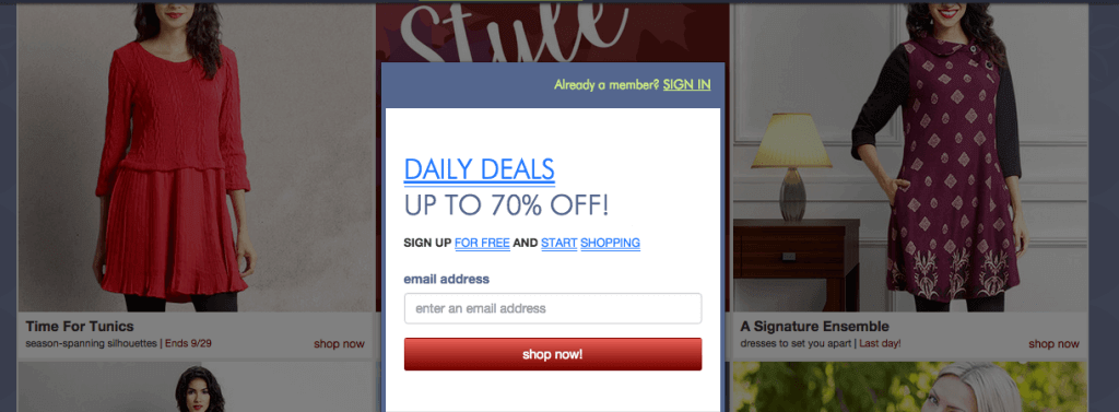
I know I’ve declined to hand over my name and phone number more times than I’ve taken the extra few minutes to fill out the contact form for my favorite sites. From a business perspective, this can be frustrating. Contact information is a great way to promote your services and generate more leads. So what can you do to build and optimize a sign-up form that actually converts? Here are six tips that will make people a little more eager to shell out their personal details:
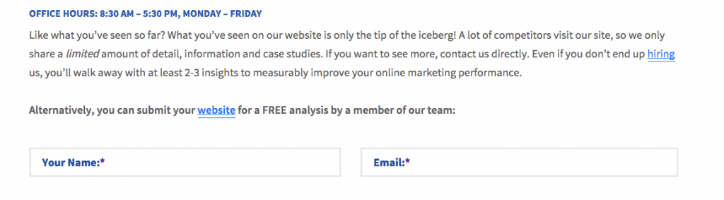
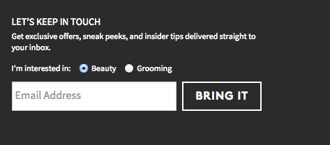
1. Use Fewer Fields
Every field of information you ask for decreases the likelihood of participation. Depending on the type of business you’re in, you probably only need an email address. When creating your contact form, evaluate the necessity of each additional field. Is the information you’ll be gaining worth the prospects you’ll be losing? If the answer is no, eliminate that field from your form.
2. Be User-friendly
This is so important. If a user can’t figure out how to fill out your contact form, they will be even less likely to participate. Ghost text can be helpful in contact fields because it is straightforward and lets the user know exactly what information you are asking for. In-line validation is also helpful. If a user has to go back and find out which field they filled out incorrectly, chances are they will just give up. Pay close attention to your “submit” and “cancel” buttons. Make sure the “submit” button is easier to see and click. If a user accidentally cancels the form, they are probably not going to go back a second time to try again.
3. Design Your Form for Mobile Users
Designing your contact form for mobile users FIRST is a good idea for several reasons. For one thing, it forces you to keep your form simple and easy to use. If users can easily type in their names and email addresses using the buttons on their cell phones, chances are they’ll be able to fill it out even more easily on a laptop. This strategy also ensures you aren’t losing potential leads because they can’t fill out your form from their phones or tablets. With more and more people using smartphones and iPads to shop for goods and services on the go, you want to be sure your site can be accessed using any device.
4. Don’t Be Picky About Format
How annoying is it when you fill out every field of a contact form and submit your data, only to get an error page insisting that your birthday was not typed in the correct format. June 28, 1987 is the same date as 6/28/87 or 06.28.1987. Don’t be too picky with your requirements, or you’ll lose more than you’ll gain.
5. Form Design Matters!
You may not think the design of your contact form matters, but let me assure you that it does. If your contact form is fun and creative, visitors will feel more inclined to use it. It should be easy to read, and include some kind of personal touch to connect and interact with users. Write the details and descriptions in a way that is more inviting and less demanding. People want to feel like they are giving their info to OTHER PEOPLE, not automated machines.
6. Be Clear About Your Intentions
Your online visitors always want to know why they are being asked to do something. If you clearly state that you won’t be sending them tons of spam mail or sharing their personal details with everyone you know, they will trust you and be more likely to give you the information you want. Make it clear that THEY are benefitting from providing their contact information. You can even give the user something in return, like a free trial, a special discount, or a closer glance at your services. Giving them some kind of motivation will make them more willing to participate.
In short, make sure your contact form is easy and convenient to use, nice to look at, and worth the user’s time to fill out. Being considerate of your online visitors will establish trust and encourage them to provide their personal information.
Need Help Improving Your Online Presence?
If you think your business could benefit from data-driven online marketing and SEO strategies, you’ve come to the right place! Blue Corona can help you analyze and transform your online presence to ensure you are reaching all your potential costumers! Check out our client testimonials and case studies or enter your URL into the box below for a free analysis of your website.

About The Author: Blue Corona's Editorial Staff is determined to help you increase your leads and sales, optimize your marketing costs, and differentiate your brand by passing on our tribal knowledge. The team vigilantly stays on top of the latest in digital marketing, bringing you the top insights with expert commentary. Want to see something on our blog you haven't seen yet? Shoot us an email and our marketing team will get to work.
View more blogs by Blue Corona
Maryland
7595 Rickenbacker Drive
Gaithersburg, MD 20879
Gaithersburg, MD 20879