(800) 696-4690
Let’s Talk Contact Us


Need Help With Your Marketing?
Web Design for Home Service Companies
Custom Contractor Websites Built to Increase Leads & Sales
As a home service company, your website is arguably your most important marketing asset, and if it isn’t growing your business, it’s time for a new one. Consider this: More than 3.5 billion Google searches are made every day. In the digital landscape of today’s business world, every company needs a website—it acts as your virtual sales rep 24 hours a day, seven days a week.
If your website isn’t mobile-friendly, is outdated, doesn’t convert visitors into leads, or simply isn’t up to your satisfaction, you need professional website design services from a home service marketing company that makes the process easy.
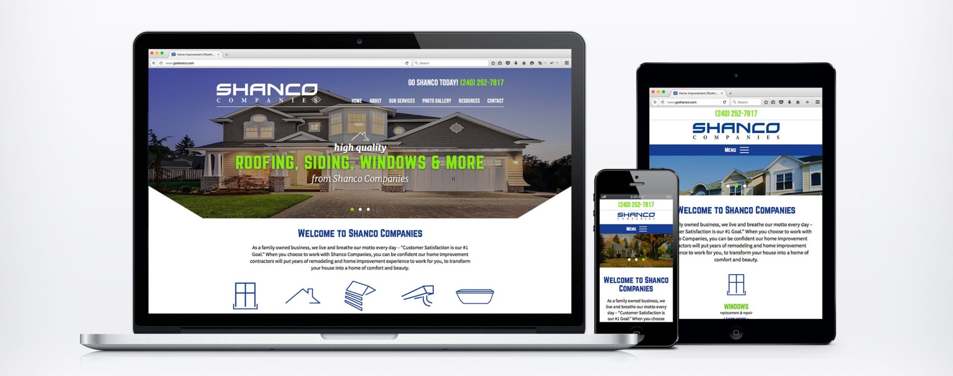
Home Improvement Company Increases Its
Conversion Rate by 33% With a New Website »
Custom Website Design Services for Home Service Companies
websites built for the trades


Characteristics of a Sales-Driving Website Design
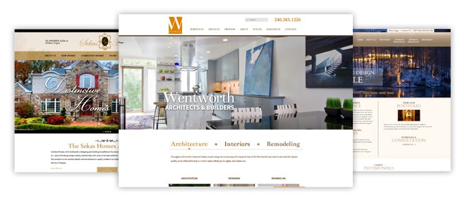
Click to View Our Web Design Portfolio!
Wondering why your competitors are outperforming you? It most likely has something to do with their website and what’s on it:
- Your website needs to be visible – When we say visible, we mean in search engines like Google. Over 90% of online experiences begin with a search engine, so your website needs to be optimized for the best search engine optimization (SEO) practices. When you choose our website design company, you’re guaranteed to have a website optimized for SEO.
- Your website needs to be mobile-friendly – 57% of all US online traffic now comes from smartphones and tablets, and 57% of users say they won’t recommend a business with a poorly designed mobile site. If that’s not enough to convince you, Google also ranks mobile-friendly websites higher in the search engine results.
- Your website needs to be secure – Data breaches and hacked consumer information have been big topics of discussion recently—and your website visitors know this. If your website has any place where users can fill in personal information (even if it’s just a phone number and email address) it needs to be secure. Google also gives a slight ranking boost to secured websites in their search results.
- Your website needs to be fast – Website visitors need to see something happen on your site in under three seconds. If not, 40% of them will leave and go to another website. Even a one-second delay can cause a 7% reduction in conversions—resulting in less revenue generated from your website.
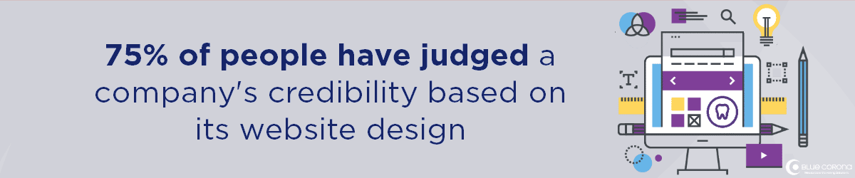
- Your website needs an optimal user experience – Once your page loads, users form an opinion in 0.5 seconds. They expect to be able to find information easily and quickly—especially from a mobile device.
Why Home Service Companies Love Our Website Design Services
You have a lot of choices when it comes to web design companies, so why choose us? As a business owner, your website should work for you. Since 2008, Blue Corona has specialized in building custom, sales-driving websites for contractors and home service businesses. Our work ranges from highly customized, multi-location franchise websites down to web design services for small businesses—we guarantee you’ll find something you like.
What’s Included In Our Web Design Services
- Website hosting (optional)
- Website security (optional)
- Custom website designs (including multiple page templates)
- Custom website coding and development
- Optimization for SEO
- Existing content import
- Advanced analytics tracking
- Lead form creation and tracking
- Website compatibility across all browsers and devices
- Integration with social media pages
- XML sitemap creation and submission
- And more
What’s more, you will 100% OWN your website—unlike a lot of other local website design companies that hold it hostage. You’d be surprised how many web design companies have hidden clauses in their contracts.
HOW MUCH DO WEBSITE DESIGN services COST?
One question we get a lot is “How much does a website cost?”
Truthfully, you can find websites for pretty much any price—but you get what you pay for.
Here’s what goes into the cost of a website:
- Hosting – This is the service or company providing space on the internet for your website. Hosting providers include WPEngine (our recommendation if you have a WordPress website), GoDaddy, InMotion, and others.
- Domain name – This is shown as www.yourcompany.com, and is usually a yearly payment.
- Design – Some designs are free, others cost money.
- Plugins and extensions – Typically, the more plugins you want, the more expensive a website gets.
- The complexity of design – The more customized your website is, the more expensive it will be.
Our web design services for home service companies aren’t one size fits all—there are no cookie-cutter solutions, at least not from the best companies. A good website design agency will help you figure out the best type of website for your business. What’s important is that your website is beautiful, thoughtfully laid out, and lead-focused.
You also need to continually update it to keep up with the modern customer’s expectations. Most website designs only have a life expectancy of 2-5 years.

A professional home services web design and digital marketing company, like Blue Corona, can help with this. Did we mention that we use years of data to guide our designs? You’re guaranteed to get a high-performing, lead-driving website.
Ready to Grow Your Business? Contact Our Website Design Team Today
Looking for affordable web design services? Blue Corona is an award-winning web design company with a team of digital designers specializing in designing and building mobile-friendly websites that:
- Increase leads
- Drive sales growth
- Optimize marketing costs
- Differentiate their brands in the marketplace
Unlike other website design companies that only focus on the look of your company’s website, Blue Corona’s web designers uniquely target your industry, your market, and your customers with precision. But don’t take our word for it—check out our website design case studies that prove it.
We’ve worked with businesses of all sizes throughout their website design projects, from small local contractors to home service franchises, and have a team of in-house website designers ready to take on your next project.
Let’s Talk About Your Next Website
Contact us online to learn more about our web design and development services and tell us about your company’s website needs.
industries we serve
Include but are not limited to:


Maryland
7595 Rickenbacker Drive
Gaithersburg, MD 20879
Gaithersburg, MD 20879