(800) 696-4690
Let’s Talk Contact Us


Need Help With Your Marketing?
SEO for Home Service Companies
The Trades’ #1 SEO Agency Driving Business Growth
Your website is a powerful sales and marketing tool—if customers can find you online. To increase monthly website traffic, calls, leads, and sales, contractors across the United States turn to Blue Corona for their home services SEO (search engine optimization) campaigns.
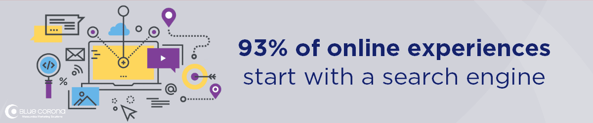
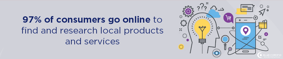
Did you know that 93% of online experiences begin with a search engine, and 97% of consumers go online to find local services? If your company doesn’t rank multiple times on the first page of Google search results for keywords related to your products or services, you’re losing website traffic, leads and sales to your competition—guaranteed. No matter what type of home service business you’ve been tasked to grow, SEO must be part of your online marketing strategy to increase revenue.
Keep reading to learn more about Blue Corona’s SEO services and how to decide if you need help from one of the best SEO companies for home service contractors out there. Ready to get started? Contact us now.
What Is SEO for Home Service Companies?
The Three Pillars of Successful SEO Services
SEO for home service companies is the process of updating and optimizing your website so that each of your web pages ranks at the top of search engines like Google, Bing, and Yahoo. Blue Corona’s SEO services for contractors and home service businesses help you measurably increase leads and sales from your website by focusing on the three pillars of successful SEO campaigns:
- Site Code & Structure – Your website must be coded so search engines can find and crawl it. Your website also needs to be fast, secure, and mobile-friendly.
- Onsite Content – You need web page after web page of unique, remarkable, and optimized content.
- Offsite Factors & Reviews – You must earn backlinks from other relevant and authoritative websites pointing to your website and generate five-star reviews on Google My Business and other places around the web.
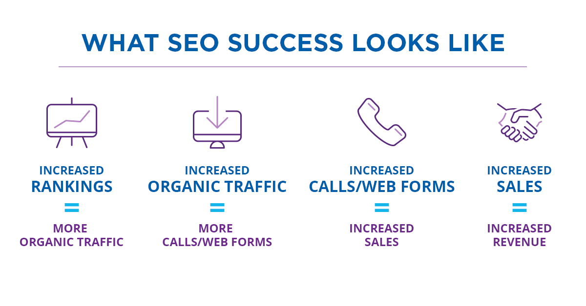
Home services SEO campaigns can create a long-term, sustainable lead generation engine for your company by:
- Improving keyword rankings on search engines
- Generating more website traffic
- Filling the top of your sales funnel with high-quality leads


What's Included in Our Search Engine Optimization Services for Home Service Companies?
Blue Corona handles the day-to-day of monitoring and improving your home services SEO campaign, including making your website more visible on Google search results and differentiating your brand across the web.


1Digital Competitive Analysis
- Complete a digital competitive analysis to see how you stack up against your top three competitors in the search results using our proprietary data tracking software
- Perform keyword research and identify the top sales-driving search terms and keywords in your market area and industry
- Establish your baseline for website code and structure, content, local visibility, and off-site citations, then compare it against your competitors to create an actionable, sales-driving plan
- Create actionable revenue goals and corresponding SEO plans
2Website Code & Structure
- Install advanced Google Analytics and call tracking
- Make your website fast, secure, and mobile-friendly
- Edit your website’s code and structure to align with best SEO practices
- Edit and optimize your existing website pages for search visibility and creative content
- Perform conversion rate optimization on all website elements (like contact forms, buttons, navigational links) to ensure an optimal experience for your customers
3New Website Content & Optimization
- Optimize existing web content to increase keyword rankings on search engines like Google, Bing, and Yahoo
- Publish new website content to expand your search visibility and fill gaps in your website’s content marketing plan
- Tweak and improve your website’s content month after month to establish your brand as THE AUTHORITY online
4Local SEO
- Locate and audit existing citations across online directories like Yelp, Facebook, Angie’s List, and more, including industry-specific directories
- Optimize your company’s Google My Business page for your business address or service area, phone number, maps listing, and business hours
- Optimize your company’s Facebook page for local SEO best practices
- Discover, manage, and monitor local citation and backlink opportunities to build authority
5Website Speed
- Reduce website bounce rate by making your web pages load faster
- Provide a better user experience for your website visitors through strategic page speed optimizations
- Optimize your website speed across mobile, desktop, and tablet devices to load lightning fast
6Review Generation & Management
- Streamline the review generation process, resulting in more 5-star reviews
- Monitor Google My Business and other online directories for negative or malicious reviews
- Respond to positive and negative customer reviews on your behalf, sending positive signals to Google and other search engines to improve the performance of your home service company’s SEO campaign
7Analytics, Tracking & Reporting
- Install industry-leading phone call tracking software and advanced Google Analytics to track the source of website visitors and new customer leads
- Track, test, and continually tweak your SEO campaigns for better performance while keeping a close eye on the competition
- Make data-driven decisions to generate more leads and sales and increase your ROI from your SEO campaign
8Dedicated Team
- Dedicated account managers who serve as your point of contact for all things digital marketing and SEO for home service companies
- SEO analysts and copywriters who know home services marketing and what it takes to increase leads and sales from the web
- Digital designers and webmasters to help you increase your website’s conversion rates and turn more visitors into leads
Why Home Service Businesses Need an SEO Company
A home services SEO company, like Blue Corona, handles the day-to-day tasks of monitoring your online presence so you can focus on other aspects of your business. If you’re like most business owners, you probably don’t have the time or resources to comb through pages upon pages of analytical data, rankings, and traffic patterns. Still don’t know if you fit the bill? If you meet any of the following requirements, your company can benefit from SEO services:
- You want to grow your business
- You currently don’t know how your website is contributing to your bottom line
- You want your company to be found in a newly expanded market area
- You want more people to call you instead of your competitors
- You want more leads
- You want more sales
- You want to differentiate your business in the online marketplace
- You want to ensure your company continues to grow in the future
- You want to outrank your competitors in the search results
How Much Do SEO Services Cost?
Wondering how much SEO services cost? The top SEO companies won’t give you a direct quote until after a thorough analysis, because it completely depends upon your needs. You can generally find reputable SEO services for home service companies that go as low as $2,500 per month for extremely small businesses, to upwards of $20,000 per month for enterprise clients.
What should really matter is your return on investment (ROI). Sure, $5,000 per month may sound like a big investment for a local business, but if your ROI turns into $50,000 per month, it’s well worth the investment.
A word of caution: you get what you pay for. If you sign up for SEO services with a cheap digital marketing company that offers low monthly payments and includes a “free” website, you may be leasing a space on their proprietary platform, meaning you lose your website and all your work once you leave.
How Long Does SEO Take to Generate Results?
We’re glad you asked! You can usually see some sort of SEO success by the end of three to six months, but for certain industries with highly competitive keywords it can take up to six months to a year to see a dramatic difference. Once you get the ball rolling, though, it’s hard to stop. Read more about how long SEO takes on our blog!
Professional SEO Services for Home Service Companies & Franchises
Local SEO Services
If you’re looking for the best SEO services for home service companies, you’ve found the one you need. We specialize in local search engine optimization, or “local SEO.” Local SEO is the process of optimizing your website for customers in your service area. Let’s face it, for local businesses relying on customers in their community for new leads and sales, earning a number one ranking on Google could be the difference between a potential customer calling you or calling your competitors.
At Blue Corona, our local SEO services maximize your online real estate on Google, Bing, and Yahoo for your most important services.
Franchise SEO Services
As a franchisee, you want your franchise to outperform your competitors in the area. The first step—attracting new customers. Blue Corona’s franchise SEO services help you do just that!
- On-page optimization – Our team of local SEO specialists will work to maximize your search presence using on-page optimization techniques like schema markup, localized content, on-page technical optimizations, and more.
- Off-site optimization – We manage your off-site SEO by actively monitoring your backlinks, including nationally syndicated business directories, niche or industry-specific directory listings, and more.
- NAP (name, address, phone) cleanup and management – One of the most important aspects of your franchise’s SEO campaign is to show up in local search. NAP cleanup and management (managing your franchise’s business directory listings) identifies your unique franchise location from other franchises in your area as well as your competitors.
- SEO reporting – Your franchise will receive a monthly SEO report customized to your franchise location. We take a data-driven approach to your franchise SEO and will measurably improve your online marketing performance.
- A dedicated account manager – Your franchise will work directly with one of our in-house account managers throughout the duration of your franchise SEO campaign. We approach every franchise SEO campaign with an ownership mentality and treat your franchise as if it were our own.
Enterprise SEO Services
Is your company being outranked by smaller businesses? Blue Corona has helped many enterprise organizations apply their real-world authority on the web, increasing organic search rankings and measurably increasing organic traffic, leads, and sales.
For a large organization that has never invested in a high-quality enterprise SEO campaign, improving your company’s yearly revenue and net income can be challenging. As an enterprise SEO service provider, our services include:
- Addressing site code and structure issues – Because enterprise websites are often massive in size, poor website hierarchy and organization can significantly impact your enterprise SEO campaign, and ultimately, your annual return on investment.
- Conquering content challenges – Enterprise-level websites are often much larger than those of local businesses. White papers, on-site content, videos, and more can clutter your website be suppressed on search rankings if not properly optimized. Let your content work for you and generate more leads and sales for your organization.
- Monitoring your off-site authority – As a large organization, your website naturally earns a high volume backlinks and citations. Enterprise SEO from Blue Corona will ensure all of your reviews are responded to and your backlinks are of the best quality.
Specializing in Home Services Marketing
Most SEO agencies have a few industries that they specialize in. At Blue Corona, our niche is helping home service companies of all sizes grow their revenue. We commonly work with businesses in the following industries and partner with home service contractors in the United States:
- Architects and Custom Builders
- Bathroom Remodelers
- Contractors
- Electricians
- Fire Protection Companies
- Flooring Companies
- Home Service Franchises
- Garage Door Companies
- Gutter Companies
- HVAC Companies
- Insulation Companies
- Kitchen Remodelers
- Landscapers
- Moving Companies
- Painters
- Pest Control Companies
- Plumbers
- Remodelers
- Restoration Companies
- Roofers
- Siding Companies
- Solar Companies
- Storage Companies
- Window and Door Companies
Don’t see your industry? Don’t worry! Contact us and we’ll help you out.
Questions to Ask an Agency Before Hiring Them for Search Engine Optimization Services
Not all SEO companies live up to their promises of more traffic, better rankings, and more leads. Some SEO firms achieve results, but they do so using “black-hat SEO” techniques. These unethical strategies can hurt your website’s rankings—and ultimately your business.
Before selecting your SEO company, make sure to ask the following questions:
- What’s in my current contract?
- What’s the process if I cancel?
- How will we communicate and how often?
- Do I have full access to my site, Google Analytics, and Google Ads accounts?
- Will I own my website?
- Do you provide guarantees?
- Have you done work like this for companies similar to mine?
- What contracts and options are available? How do I determine the right budget?
- What are all your fees and payment options?
Avoid any search engine optimization services that “guarantee” any of the following:
- Overnight rankings
- Doubled traffic within a certain amount of time
- Instant leads
- Search engine submissions
- A certain amount of backlinks in a certain amount of time
- Any sort of ROI projections
SIGNS OF BLACK HAT SEO
A red flag should go up anytime an SEO company makes certain claims or promises about results. The SEOs that give our industry a bad name for gaming rankings do it by:
- Buying a ton of links from random, crappy websites
- Keyword stuffing
- Cloaking content so users and search engines see different things
- Using a computer program to generate hundreds of pages of garbage
- Using duplicate or scraped content
- Submitting fake press releases in order to spam links
READ MORE
industries we serve
Include but are not limited to:
- Architects and Custom Builders
- Bathroom Remodelers
- Construction Companies
- Contractors
- Electricians
- Fire Protection
- Flooring Companies
- Home Service Franchises
- Garage Door Companies
SEO FAQs
What is SEO?
SEO is the process of editing and creating website content and code that ranks well on search engines like Google, Bing, and Yahoo. First, your website must be coded so search engines can find and crawl it. Your website also needs to be fast, secure, and mobile-friendly. Second, you need web page after web page of unique, remarkable, and optimized content. Third, you must gain citations, links, and references from other relevant and authoritative websites.
What’s included in SEO services?
SEO for home service companies from Blue Corona includes the following:
- A Digital Competitive Analysis – We’ll show you how your SEO stacks up against your top competitors, including new keyword ranking opportunities, areas where your SEO campaign is falling short today, and a customized SEO plan to measurably improve website traffic to your home service company’s website.
- Website Content and Code Optimization – Your website will be easily found by search engines and accessible to users.
- New Website Content and Creatives – Our team will publish SEO-friendly content each month tailored to your customers’ needs and wants that converts site visitors into leads.
- Local Citation Optimization (Local SEO) – Increase your brand’s online authority and generate more website traffic with local SEO.
- SEO Reporting – Meet with your dedicated Blue Corona account manager each month to review your SEO performance each month and discuss new opportunities for improvement.
- Continual Tracking and Tweaking of Your Campaign – Our mantra is “track, test, tweak, repeat” and we don’t rest until your schedule is full of booked appointments. We work to continually improve your organic search visibility.
Should I hire an SEO company?
An SEO company handles the day-to-day tasks of monitoring your online presence so you can focus on other aspects of your business. If you don’t have the time or resources to comb through pages upon pages of analytical data, rankings, and traffic patterns and then have the means to optimize accordingly, you need an SEO company.
How long does SEO take?
If you’ve got a good SEO partner, you can generally see results between 3-6 months, but certain industries with highly competitive keywords can take up to a year to see traction. Don’t give up, though—once you get going, your results will snowball.
How does Blue Corona track SEO success?
If you can’t measure it, you can’t manage it. You can’t win the game if you don’t know the score. Despite a million quotes that suggest that you can’t maximize your business success unless you track your results, most business owners and marketers are still not accurately tracking their advertising, marketing, website, or SEO. Most online marketing companies treat tracking and reporting as an afterthought—the last step. At Blue Corona, it’s the first step in every SEO engagement.
Is Blue Corona a certified Google Partner?
Yes, Blue Corona is a Google Premier Partner, a distinction reserved for the top 3% of marketing agencies and SEO companies for home service businesses in North America.
CASE STUDY
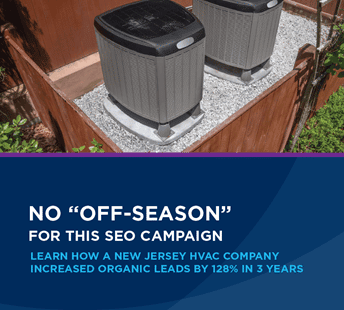
Contractor Generates A 128% Lead Increase
Why Select Blue Corona Over Other Home Service SEO Companies?
At Blue Corona, we try and let our clients speak for us. Take a look at our search engine optimization reviews and hear straight from them why we are the best home service SEO company for your needs. Above all, everything we do comes from the perspective of a business owner, and we treat your business like our own.
Done that? Great! Let’s get down to the details. We can offer you a few guarantees other companies can’t:

- You don’t have to worry about long-term contracts. We won’t handcuff you for a specific amount of time. Ever.
- You’ll own every single deliverable, from your website to your content. Some SEO companies won’t let you keep your work when you leave. Not us.
- You’ll optimize your marketing costs. Everything we do is tracked, measured, and analyzed for improvements. This lowers your costs and raises results.
- You’ll have peace of mind that we will bend over backwards for you. SEO is a long-term investment, which is why we believe in building partnerships, not acquiring clients.
- You get a dedicated Account Manager to be your guide, as well as a support team that includes an analyst, web designer/developer, and a dedicated (U.S.-based) copywriter.
- You get detailed monthly reports (you can actually understand) that connect SEO performance to your bottom line.
Our Happy Clients
I would 100% recommend Blue Corona to any new, aspiring HVAC, plumbing, electrical service, home services type business that is looking to expand the footprint of Internet marketing truly because the sense of, they're not like your every other internet marketing company. They're not going to sell you a bill of goods and over-promise and under-deliver. They're going to under-promise and over-deliver.
Arctic Air Conditioning
There's been plenty of times where we would sit back and look at things and go, "Hey, you know what? That's probably the best decision we made in a long time." I would definitely recommend [Blue Corona] to other service companies because I want to see how other people like me and my family here at work succeed.
Blind & Sons
"Blue Corona has been our marketing agency for over a year now. They have provided great services and strategies for accelerating our business growth. Most importantly, they are willing and able to adapt our marketing strategy to help us succeed in our industry. Our account manager has been awesome! She is and has been such an asset to Reliable Power Systems."
Reliable Power Systems
"Since working with Blue Corona our lead quality and profitability have skyrocketed! They give you advice on what is best for you rather what would line their own pockets. I have also been impressed by the quality of services (ad copy, amazing web design) and constant communication and tracking Blue Corona offers. Our account manager is truly a pleasure to work with. She is great at setting expectations and delivering results. I have worked with many marketing agencies and have...
Penguin Air, Plumbing & Electrical
"We have been partnering with Blue Corona for a couple of years now, and we are very pleased with the results. From the initial phase of learning our company's challenges and needs to the development of an effective online marketing strategy, working with the entire BC team has been a pleasure. The results have been tangible, and we're seeing an increase in leads and website visits across the board. One important asset BC brings to the table is their team's...
DiFabion Remodeling
"I’m very happy with the progress of Blue Corona’s SEO and pay-per-click campaigns for my garage door business. Blue Corona has helped improve our online visibility and generate more leads."
Overhead Door of Indianapolis
"I've been with Blue Corona for over a year now. Hands down one of the best decisions I made for my business. The improvements they've made to my website, SEO, and general lead flow are so much better than previous companies I've worked with. One of the main reasons I chose them is they made decisions based on data and facts. Everything we do is measurable and they hold themselves accountable to the goals we collectively established. While all of...
Zen Windows – Charlotte
"The switch to Blue Corona for our digital marketing needs was the best switch our team ever could have made. Our account manager is the best. She and her team are constantly staying a step ahead of industry trends and keeping us informed of best practices for our brand. We have seen tremendous results in a short time since beginning our partnership with Blue Corona, and we look forward to a long and fruitful relationship with their phenomenal team."
Robin Aire
"I work for an Ohio HVAC, plumbing, electric, and indoor air quality company. Blue Corona has been nothing but helpful. We've used their services for several years and never had any issues. They've helped us improve PPC, SEO, social media, Local Services ads, and anything in between. I would 100% recommend using their services."
Blind & Sons
"Blue Corona has proven to be an integral marketing partner for our team. They handled our website revamp, as well as have continued to work with us to optimize our SEO, create campaigns, and evaluate our lead volume. Not only have we appreciated their professionalism, but we are so thankful for their assistance in facilitating our online growth."
Jacob Heating & Air Conditioning


Maryland
7595 Rickenbacker Drive
Gaithersburg, MD 20879
Gaithersburg, MD 20879